
Visualizing Sensor Data: A Sneak Peek into Our New Chart Features
Hey there, fellow grow enthusiasts! 🌱
We’re back with another update from the Weed Garden
kitchen, and boy, do we have some exciting news to share! As you know, we’ve been on a relentless quest to make your grow management experience as seamless and effective as possible. And that means constantly refining our approach and sometimes making some pretty big pivots along the way.
The Journey So Far: Ledger Databases, Sensor Tables, and Beyond
If you've been following our progress, you know we’ve been experimenting with different ways to handle data storage and visualization. We started down the path of using ledger databases, thinking they’d offer a solid, immutable way to track every change in your grow environment. But, after much back and forth, we realized that while ledger databases are fantastic for certain use cases, they didn’t quite fit the bill for what we wanted to achieve with our sensor data.
Why the Pivot? Well, that's the beauty of working in an agile environment. As we dug deeper, we realized that ledger databases might be overkill for our needs. They’re great for ensuring data integrity and tracking changes, but they’re not always the best for handling time series data that requires frequent updates and real-time processing. So, we’ve pivoted to a more straightforward approach using dedicated sensor tables.

By making this switch, we’re now able to handle sensor data more efficiently and present it in a way that’s easier to understand and interact with. This means faster updates, more accurate real-time monitoring, and ultimately, better insights for your grow.
Agile Development: Embracing Change and Refining the Vision
One of the things we love about the way we work is our commitment to agility. No, we're not talking about jumping through hoops or doing back flips—though that would be impressive! We're talking about our ability to pivot, adapt, and refine our approach based on what makes the most sense for our users.
Agile development isn't just a buzzword for us; it's a philosophy. It means we’re always ready to change course if something isn’t working or if we find a better way to do things. So, when we saw that the ledger database approach was causing more complexity than it was worth, we didn’t hesitate to switch gears and move towards a simpler, more effective solution.
Introducing Our New Chart Features
With this new approach, we’re building some awesome new chart features to help you visualize your grow data like never before.
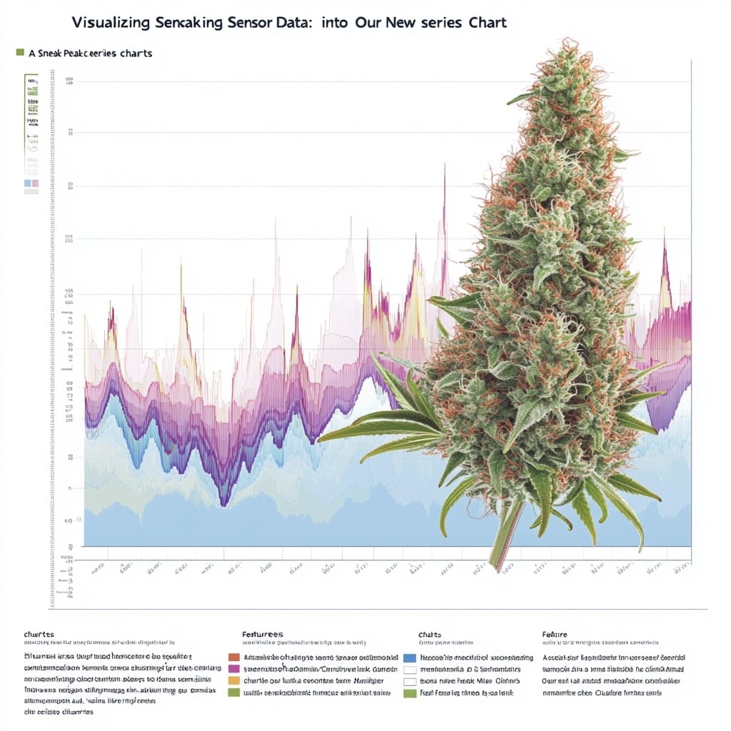
1. Multi-Sensor Time Series Chart
This one’s a game-changer. Our multi-sensor time series chart lets you overlay different data sets—humidity, temperature, light exposure—on a single chart, all sharing the same time axis. It’s a powerful way to visualize how different environmental factors interact and affect your grow. You can select which sensor data to display and instantly see trends and correlations.

Need to know if a temperature spike always coincides with a dip in humidity? Or if your plants are getting more light than they need? This chart will have you covered, helping you make smarter decisions to optimize your grow.
2. Individual Sensor Charts with Threshold Indicators
While the combined chart provides an overview, sometimes you want to drill down into the details. Our individual sensor charts come with high and low threshold indicators to alert you when readings go out of your desired range. This way, you’re never caught off guard.
These charts are your go-to tool for monitoring specific parameters. They provide clear visual cues when something’s off, letting you take action before minor issues turn into major problems.
It’s a Work in Progress!
We’re still in the early stages with these features, so what you see now is built on dummy data. But don't worry—we're hard at work integrating real-time data feeds and refining the user experience. Our goal is to ensure that by the time these charts go live, they’ll be robust, accurate, and ready to give you the insights you need.
We’re using this period to test different scenarios, refine our algorithms, and make sure everything works smoothly. And because we’re agile, we’re constantly iterating. If something doesn’t work, we pivot. If we find a better solution, we adapt. All to make sure we’re delivering the best possible tool for your grow.
What’s Next?
As always, we value your feedback and input. These tools are for you, and we want to make sure they’re as useful and intuitive as possible. If you have any suggestions, ideas, or things you'd love to see, drop us a line in the comments!
We’re also exploring more advanced features, like predictive analytics and third-party sensor integrations. Our aim is to turn your grow data into actionable insights, so you can cultivate with confidence.
Final Thoughts
This journey is a marathon, not a sprint, and we’re thrilled to have you along for the ride. Remember, every great tool starts as a rough draft, and we're all about refining, rethinking, and sometimes completely rewriting the rules to make sure we're delivering the best for you.
Peace, love, and happy growing! ✌️🌿
That’s all for now, folks! Stay tuned for more updates, and keep those suggestions coming. Together, let’s build the ultimate grow management platform!
Remember, agility isn’t just for cats and developers—it’s for anyone committed to constant improvement. Let’s keep growing, learning, and evolving together.
Catch you in the next update!
— Parker Blunt